
The New Anti-Design
The Rules of Graphic Design Are Completely Bogus... Except for the Ones That Aren't

This isn’t an anti-design manifesto. It’s an honest look at the perpetual motion machine of dogmatic thinking.
The simple truth is this: at its core, good design relies on a set of principles so ingrained in human perception that even the untrained eye can tell good from bad. Sure, there are different preferences and tastes, but underneath it all we have an innate ability to detect muddy design versus clarity. We’ve been honing that perception our entire lives. It’s how we can decode an entire room’s worth of busy visual stimuli in a microsecond. Enough information that it’d take entire pages to describe it all.

Photo by Glenn Carstens-Peters on Unsplash
So every time I hear a designer scoff at criticism from a layperson, my autonomic nervous system kicks in. My eyes are rolling even before they finish the all-too-common deflection: they just can’t understand good design.
Beyond survival instincts and general human perception, just about everyone on Earth has been trained ad nauseam by a never-ending cavalcade of meticulously designed content. Posters, album covers, magazines, book covers, TV shows, movies, and advertisements. We know design intimately. Maybe we don’t have the words for it or the formal training to understand why something works. But make no mistake, we can absolutely point to designs that look amazing and those that look awful.
Now is about the time I need to clarify something. I am not a professional designer. I’m barely a designer at all. I’m a first-semester design student. So do with that information as you will. Whether that be to take a minute to read what may be a fresh perspective or discard it wholesale... not necessarily on the merits, but on the principle of “how dare he.”
To address the 10-megaton bomb I planted in the headline: It’s true. I sincerely believe much of what is borne out through design groups, and critiques are nothing more than an ideological circle jerk. Gatekeeping, to keep the dogs at bay.
I’m not arguing against fundamental design principles. The importance of Color, of Composition, of Contrast and Layout, of striking images and unified thematic elements will always exist, even in contrarian Anti-Design. I am specifically laser-painting the social rules, the pedagogical norms, and the academic framing used to assess design work.
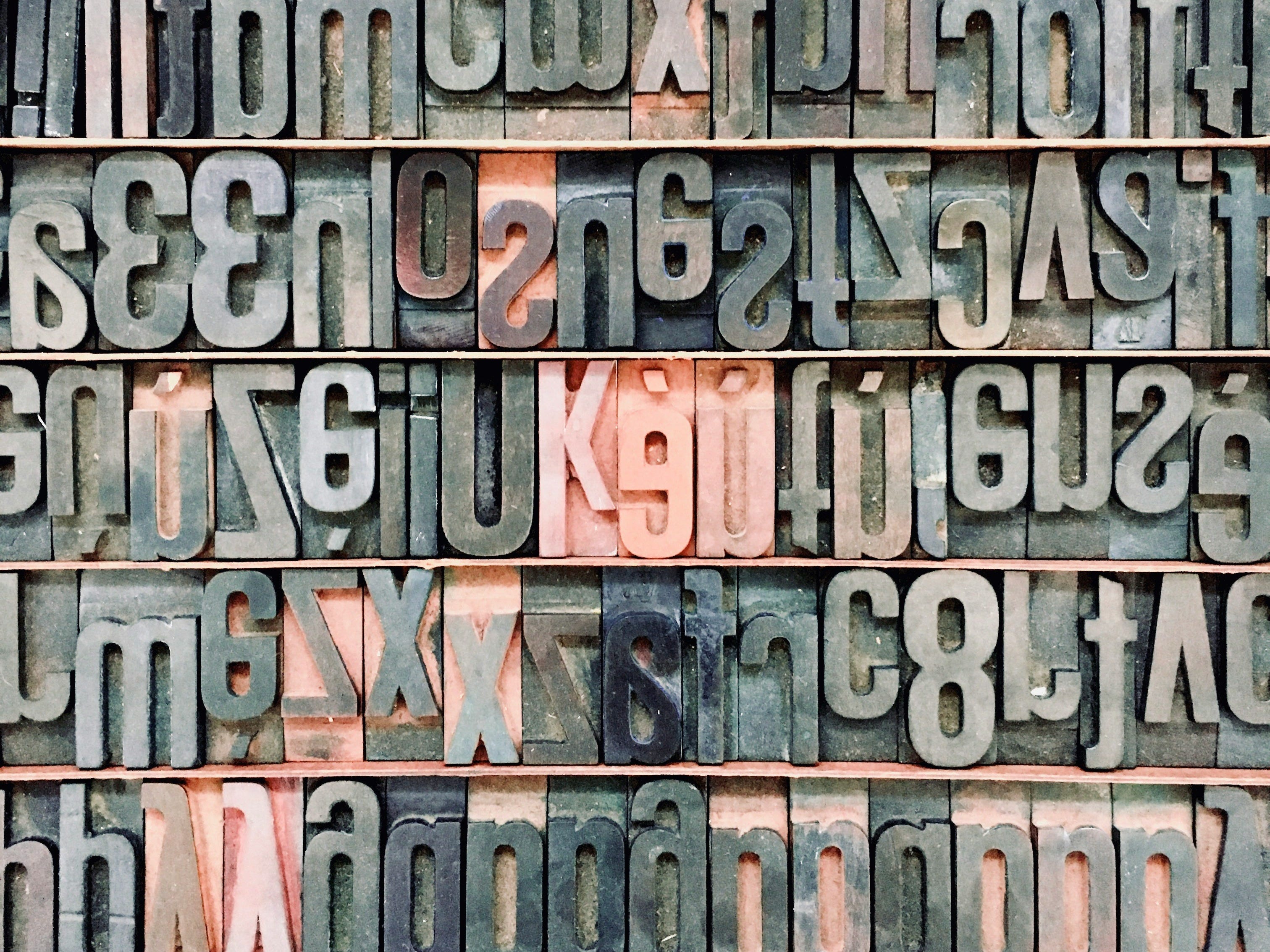
Photo by Fabio Santaniello Bruun on Unsplash
Nowhere is this more apparent than Typography.
Outside of design circles, no one can reasonably tell the difference between most categorically similar fonts. And more importantly, no one cares. Professional designers and typographers are probably throwing their MacBook Pros across the room right now. But deny it all you want, a poster that uses Times New Roman, for all intents and purposes, looks nearly indistinguishable from the same poster using Garamond. No one passing by an advertisement as they walk through a busy subway terminal is ever going to notice.
It’s the same as those spot the difference puzzles. Set two nearly identical images side by side and sure, eventually you’ll spot that the tree in the background has five leaves instead of six. But you only find it because someone told you to look. Nobody glancing at a single image is hunting for the missing leaf. Fonts are no different. Line up Helvetica and Arial and a determined person might eventually clock the difference. Out in the wild, on a poster they pass in three seconds, that difference may as well not exist.
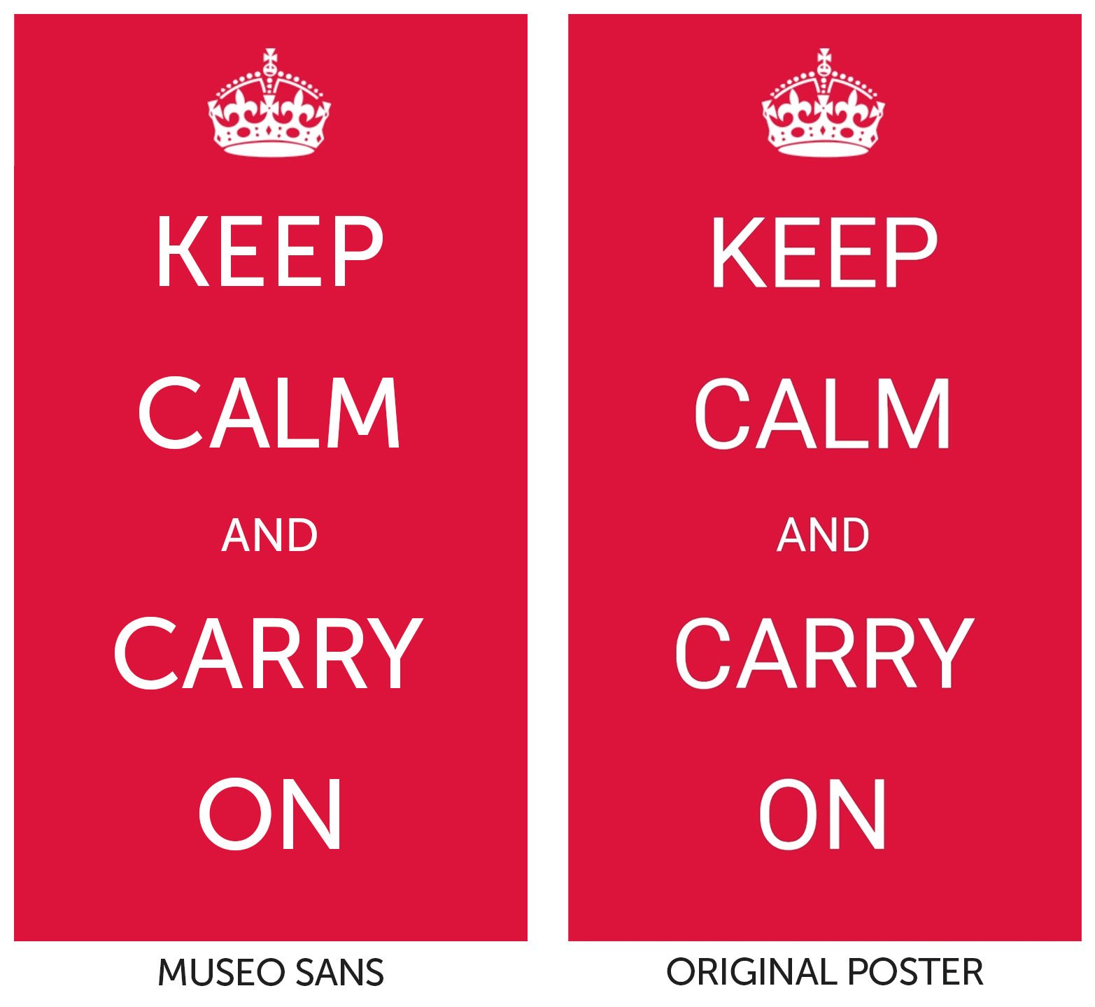
Someone will inevitably point to IKEA swapping its font in 2009 and the uproar that followed. But that proves nothing about one font being better than another. People weren’t reacting to typography. They were reacting to change. An established, iconic brand they’d seen their whole lives suddenly looked a little off, and a handful of people online said so. That is not the same as judging a fresh design on its merits. Most of the noise was social contagion, people piling into an online pile-on they’d have scrolled right past otherwise. Strip away the buzz and the overwhelming majority never would have noticed, let alone cared. Going along to get along is a powerful thing.
There’s an inevitability to design critiques that I find particularly maddening. At some point, no matter the work, the feedback arrives dressed in the language of suggestion. Maybe you could try this. Maybe you could change that. Maybe consider this instead.
Maybe?
That’s not a critique. That’s a guessing game moderated by someone operating under the assumption that you hadn’t already tried a hundred variations and landed on the best of the bunch. The word Maybe implies that a better outcome exists. But it’s a hypothetical better outcome. An untested one. A conceptualization floating somewhere in the assessor’s imagination that has never been executed, never been tested against the brief, never been measured against the actual constraints of the project.
Photo by Kelly Sikkema on Unsplash
So how exactly do you mark someone down for not arriving at a destination you’re not even sure exists?
This is the same kind of thinking where a single design presented by a first-year student will be criticized and torn apart while the exact same design presented by a famous designer will be praised as brave or exciting work. Every mistake of the student now rendered genius intentional design in a thrilling explorative piece. Suddenly the scoring rubric becomes infinitely more malleable, bending to the fancy of the assessor.
If design is truly separate from art, if its true measure of success is how effectively it conveys a message, then intentionality and provenance are irrelevant.
Design isn’t aimed at Designers; it’s not targeting the academically sophisticated. It is aimed directly at average everyday people. The people, as noted above, who know enough to tell good design from bad. Measuring it by that standard means any designer who says the viewer doesn’t know enough to understand it is missing the point by light-years.
Photo by John Jennings on Unsplash
On the other hand, if Design is actually Art, then how dare you as a Designer tell someone else they haven’t earned the right to color outside the lines. Art isn’t paint-by-numbers.
Either way, in this particular context, it’s a distinction without a difference as the focal points of both schools of thought converge. The rules exist to serve the viewer, not to exclude them. When the rules start serving the gatekeepers instead, they stop being design principles and start being something else entirely.
Call it what you want. Just don’t call it good design.
Don’t believe I’ve earned the right to flip over the apple cart? Feel free to file a Hurt Feelings Report Below.
About Liminal Space Creative
Independent creator attempting to spill the messy worlds in my head onto the page. At present, I am attending online design school as part of a very unexpected and unplanned career change. This space is where I will share random pieces of the journey: inspiration, experiments, school projects, and lessons I learn along the way.
This feels less like an essay about design and more like an essay about expertise. Every field seems to accumulate rules that start as useful heuristics and eventually become identity markers. The difficult question is which rules are serving the audience and which are serving the institution.